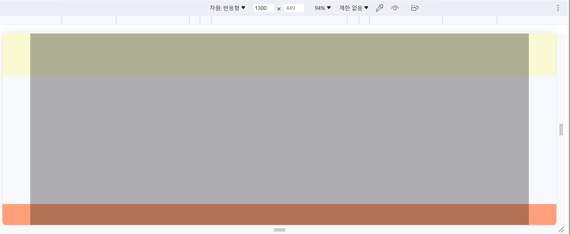
Layout 유형 (1)
1) 구조 작업
HTML, CSS 구조화
2) 가운데 영역 작업
- 각각의 영역 안에 .container를 만들어 준다.
- container는 재활용 가능한 CSS 코드로 작성
- 가운데 영역 너비 지정
- margin: 0 auto; 👉🏻 가운데로 밀어준다.
- height: inherit; 👉🏻 상속 받는다.
3) 미디어 쿼리
- 변경할 코드를 작성해준다.
- width 기본값 100%


<!DOCTYPE html>
<html lang="en">
<head>
    <meta charset="UTF-8">
    <meta name="viewport" content="width=, initial-scale=1.0">
    <title>Layout01-4 미디어쿼리</title>
    <style>
        * {
            margin: 0;
            padding: 0;
        }
        .container {
            width: 1200px;
            height: inherit;
            background-color: rgba(0, 0, 0, 0.3);
            margin: 0 auto;
        }
        #header{
            height: 100px;
            background: lightgoldenrodyellow;
        }
        #slider{
            height: 300px;
            background-color: ghostwhite
        }
        #about{
            height: 580px;
            background-color: lightsalmon
        }
        #footer{
            height: 100px;
            background-color: lightgoldenrodyellow;
        }
        /* 미디어쿼리 */
        @media (max-width: 1300px){
            .container {
                width: 90%;
            }
        }
        @media (max-width: 768px){
            .container {
                width: 100%;
            }
        /* @media (max-width: 480px){
            .container {
                width: 100%;
            } */
        }
    </style>
</head>
<body>
    <div class="wrap">
        <header id="header">
            <div class="container"></div>
        </header>
        <section id="slider">
            <div class="container"></div>
        </section>
        <section id="about">
            <div class="container"></div>
        </section>
        <footer id="footer">
            <div class="container"></div>
        </footer>
    </div>
</body>
</html>
'공부 모음집 > 실습 기록' 카테고리의 다른 글
| [CSS] box-shadow (0) | 2023.10.23 |
|---|---|
| [👩🏻💻 연습] 반응형 Navbar 만들기 (+ 미디어쿼리, 햄버거 메뉴 토글 버튼, 자바스크립트 적용) (0) | 2023.10.21 |
| [👩🏻💻 연습] display: flex/ position: absolute/ transform: translate (1) | 2023.10.19 |
| [👩🏻💻 정리] HTML <head> 작성 방법 정리 (0) | 2023.10.17 |
| 🙅🏻♀️ [CSS] z-index로 앞뒤로 보내기 (+parallax 효과) (0) | 2023.10.11 |