레이아웃 (2) - flex, grid
1. display: flex로 레이아웃 잡기

- * { margin: 0; padding: 0; } 으로 여백을 없애준다.
- 블록 구조를 가운데로 오게 하고 싶다?면 width 값(전체 너비) 같이 쓰고, margin: 0 auto;(가운데) 설정하면 된다.
- #main은 합쳐진 부모 요소기 때문에 아무것도 없다. 자식 요소에 같은 값을 가진 것이 있다면 작성할 필요 없다.
- <main>은 하나만 가질 수 있다.
- <main> 안에 있는 아이템들을 정렬하고 싶다면, #main { display: flex; } 값을 준다.
- 너비의 기본값은 100%기 때문에 작성하지 않아도 된다.
- 미디어쿼리에 #main { flex-wrap: wrap; } 을 넣어줘야 반응형으로 줄바꿈이 된다.
- 미디어 쿼리 작성할 때 상속이 되므로 똑같으면 작성해줄 필요 없다.
<head>
    <meta charset="UTF-8">
    <meta name="viewport" content="width=device-width, initial-scale=1.0">
    <title>Layout2 - flex</title>
    <style>
        * {
            margin: 0;
            padding: 0;
        }

        body {
            background-color: #E8F5E9;
        }

        #wrap {
            width: 1200px;
            margin: 0 auto;
        }

        #header {
            height: 100px;
            background-color: aliceblue;
        }

        #nav {
            height: 100px;
            background-color: seashell;
        }

        #main {
            display: flex;
        }

        #aside {
            width: 30%;
            height: 780px;
            background-color: beige;
        }

        #section {
            width: 40%;
            height: 780px;
            background-color: blanchedalmond;
        }

        #article {
            width: 30%;
            height: 780px;
            background-color: bisque;
        }

        #footer {
            height: 100px;
            background-color: aliceblue;
        }
    </style>
</head>
<body>
    <div id="wrap">
        <header id="header"></header>
        <nav id="nav"></nav>
        <main id="main">
            <aside id="aside"></aside>
            <section id="section"></section>
            <article id="article"></article>
        </main>
        <footer id="footer"></footer>
    </div>
</body>
</html>
[flex- 미디어쿼리로 반응형 만들어주기]


* {
            margin: 0;
            padding: 0;
        }

        body {
            background-color: #E8F5E9;
        }

        #wrap {
            width: 1200px;
            margin: 0 auto;
        }

        #header {
            height: 100px;
            background-color: aliceblue;
        }

        #nav {
            height: 100px;
            background-color: seashell;
        }

        #main {
            display: flex;
        }

        #aside {
            width: 30%;
            height: 780px;
            background-color: beige;
        }

        #section {
            width: 40%;
            height: 780px;
            background-color: blanchedalmond;
        }

        #article {
            width: 30%;
            height: 780px;
            background-color: bisque;
        }

        #footer {
            height: 100px;
            background-color: aliceblue;
        }

        @media screen and (max-width: 1300px) {
            #wrap {
                width: 90%;
            }
        }
        /* 크기만 바꿔주면 된다. */
        @media screen and (max-width: 768px) {
            #wrap {
                width: 100%;
            }
            #main {
                flex-wrap: wrap;
            }
            #aside {
                width: 30%;
                height: 630px;
            }
            #section {
                width: 70%;
                height: 630px;
            }
            #article {
                width: 100%;
                height: 150px;
            }
        }
        /* 한 줄로 바꿔주면 되니까 너비 100%로 */
        @media screen and (max-width: 480px) {
            #aside {
                width: 100%;
                height: 200px;
            }
            #section {
                width: 100%;
                height: 140px;
            }
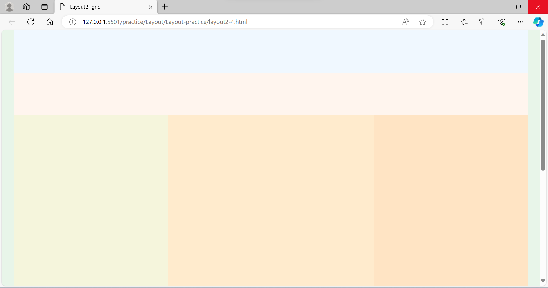
1. display: grid로 레이아웃 잡기
- 그리드는 부모가 다 처리한다.
- grid-template-columns: 30% 40% 30%;
- grid-template-rows: 780px;
		* {
            margin: 0;
            padding: 0;
        }

        body {
            background-color: #E8F5E9;
        }

        #wrap {
            width: 1200px;
            margin: 0 auto;
        }

        #header {
            height: 100px;
            background-color: aliceblue;
        }

        #nav {
            height: 100px;
            background-color: seashell;
        }

        #main {
            display: grid;
            grid-template-columns: 30% 40% 30%;
            grid-template-rows: 780px;
        }

        #aside {
            background-color: beige;
        }

        #section {
            background-color: blanchedalmond;
        }

        #article {
            background-color: bisque;
        }

        #footer {
            height: 100px;
            background-color: aliceblue;
        }
[grid- 미디어쿼리로 반응형 만들어주기]
@media screen and (max-width: 1300px) {
            #wrap {
                width: 90%;
            }
        }

@media screen and (max-width: 768px) {
    #wrap {
        width: 100%;
    }
    #main {
        grid-template-areas:
            "aside section"
            "article article"
        ;
        grid-template-columns: 30% 70%;
        grid-template-rows: 680px 150px;
    }
    #aside {
        grid-area: aside;
    }
    #section {
        grid-area: section;
    }
    #article {
        grid-area: article;
    }
}

@media screen and (max-width: 480px) {
    #main {
        grid-template-areas:
            "aside"
                    "section"
                    "article"
                ;
                grid-template-columns: 100%;
                grid-template-rows: 200px 430px 150px;
            }

}'공부 모음집 > 실습 기록' 카테고리의 다른 글
| [CSS] transform-origin (1) | 2023.11.20 |
|---|---|
| [👩🏻💻 연습] Google 페이지 따라 만들어 보기 (0) | 2023.10.25 |
| [CSS] box-shadow (0) | 2023.10.23 |
| [👩🏻💻 연습] 반응형 Navbar 만들기 (+ 미디어쿼리, 햄버거 메뉴 토글 버튼, 자바스크립트 적용) (0) | 2023.10.21 |
| [레이아웃] Layout 유형 (1) (0) | 2023.10.20 |